Product & Design · 22 Sep 2026 · 5 min read
UX design process: from wireframes to a tested prototype
A practical UX design process: research, user flows, wireframes, a clickable prototype and usability testing, so the design is proven before development starts.
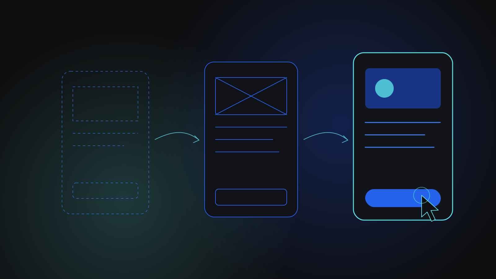
A good UX design process moves from understanding the problem, to mapping user flows, to rough wireframes, to a clickable prototype that real users test before any production code is written. Each step is cheaper to change than the one after it, and that is the whole point. The goal is not beautiful screens; it is a design you have evidence will work.
What are the stages of a UX design process?
Teams name them differently, but the stages are consistent:
- Discovery: who the users are, what they are trying to get done and what the business needs.
- User flows: the paths people take through the product to complete each task.
- Wireframes: low-fidelity layouts that settle structure and content without visual polish.
- Visual design and a design system: the look, the components and their states, applied consistently.
- Prototype: linked screens that someone can click through as if it were the real product.
- Usability testing: watching real users attempt real tasks, then fixing what they struggle with.
- Handover: specifications and assets that developers can build from without guessing.
The stages overlap, and testing often sends you back to the flows. That is expected, and it is far cheaper than finding the same problem after launch.
Why start with research instead of screens?
Screens answer the question of what a product looks like before anyone has settled what it is for. Early research does not have to be heavy. A handful of conversations with target users, a look at the tools they rely on today and a clear written statement of the problem are often enough to prevent the most expensive mistake in design, which is designing the wrong thing well.
Write down the few tasks that matter most. For a study app it might be uploading a document and getting notes back. For a compliance platform it might be seeing which requirements apply and what evidence is still missing. Every later design decision can then be checked against those tasks instead of against opinion.
Research should also capture constraints: the devices people use, where they will be when they use the product, and any accessibility needs. A tool used on a phone between appointments needs a different design from one used at a desk all day.
How detailed should wireframes be?
Detailed enough to test structure, rough enough that nobody is attached to them. Wireframes should show what is on each screen, in what order, and what happens when someone taps or clicks. They should not use final colours, imagery or polished copy, because those invite feedback about taste at a stage when you need feedback about flow.
Include the unglamorous states: empty screens, loading, errors, permissions and what a user sees on their very first visit. These are where products usually feel unfinished, and they are much cheaper to design now than to discover halfway through development.
Wireframes are also the right moment to test navigation and naming. Walk someone through the screens and ask where they would go to do each key task. If people look for a feature in a different place from where you put it, move it, or rename it. Arguments about labels and menu structure are quick to settle with a wireframe and slow to settle once the screens have been built and styled.
Every change is cheapest on paper, cheap in a wireframe, affordable in a prototype and expensive in code.
What makes a prototype worth testing?
A prototype is worth testing when someone can attempt a real task without you explaining it. That usually means linked screens in a tool such as Figma covering one or two complete flows from start to finish, with realistic content instead of placeholder text. It can skip the screens you are confident about and focus on the paths you are least sure about.
A design system built alongside the prototype pays off later. In one of our projects, an education compliance platform, a Figma design system came before the Next.js front end was built, so engineers had consistent components to build from. When scope friction arose partway through, the team moved to wireframe-first reviews, so screens were agreed before they were built. Design ran ahead of the code rather than trying to keep pace with it.
How do you run usability testing on a prototype?
Keep it simple and repeatable:
- Recruit a few people who resemble your actual users, not colleagues who already know the product.
- Give each person a goal rather than instructions: "save this form and come back to it later", not "click the save button".
- Ask them to think aloud, and resist the urge to help.
- Note where they hesitate, backtrack or give up, and what they expected to happen instead.
- Fix the biggest problems, then test again with new people.
Small rounds of testing, repeated, tend to reveal more than one large study at the end. Patterns show up quickly: if several people miss the same button, the problem is the design, not the users.
Some problems only appear in real conditions, so test on the devices and entry points your users actually arrive through. In one of our projects, an AI study platform for students that was designed in Figma before it was built, in-app browsers inside social media apps blocked Google sign-in after launch, disrupting login for people arriving from those apps. The fix was a browser detection and redirect flow. It is exactly the kind of issue that testing from those entry points can catch earlier.
How do you hand a tested prototype to developers?
A tested prototype only has value if it survives the move into code. Good handover includes component specifications, spacing and type rules, every interaction state, responsive behaviour and clear notes on anything the prototype faked. Developers should see the designs before handover, not after: they will spot what is expensive to build and suggest cheaper ways to achieve the same experience.
That is why we keep design and engineering in the same team. Our UI/UX Design & Prototyping service works with the engineers who will build the product, so trade-offs are discussed while they are still cheap. The design then carries into development through agile sprints, and once the product is live, real usage feeds the next round of improvements.
What are the most common UX design process mistakes?
- Jumping to high-fidelity screens before the flows are agreed.
- Designing only the ideal path and ignoring errors, empty states and edge cases.
- Testing with people who already know the product.
- Treating the prototype as a sign-off document rather than something to learn from.
- Handing designs to developers without walking through them together.
Key takeaways
- A sound UX design process moves from research to flows, wireframes, a prototype and usability testing before development begins.
- Keep wireframes rough and focused on structure, and design empty, error and loading states early.
- Prototype the paths you are least sure about, using realistic content.
- Test with real users in small, repeated rounds, on the devices and entry points they actually use.
- Involve developers before handover so the tested design survives contact with code.
- Design
- UX
- Prototyping
Related services
Related case studies
EducationSaaS
AI study and writing tools platform
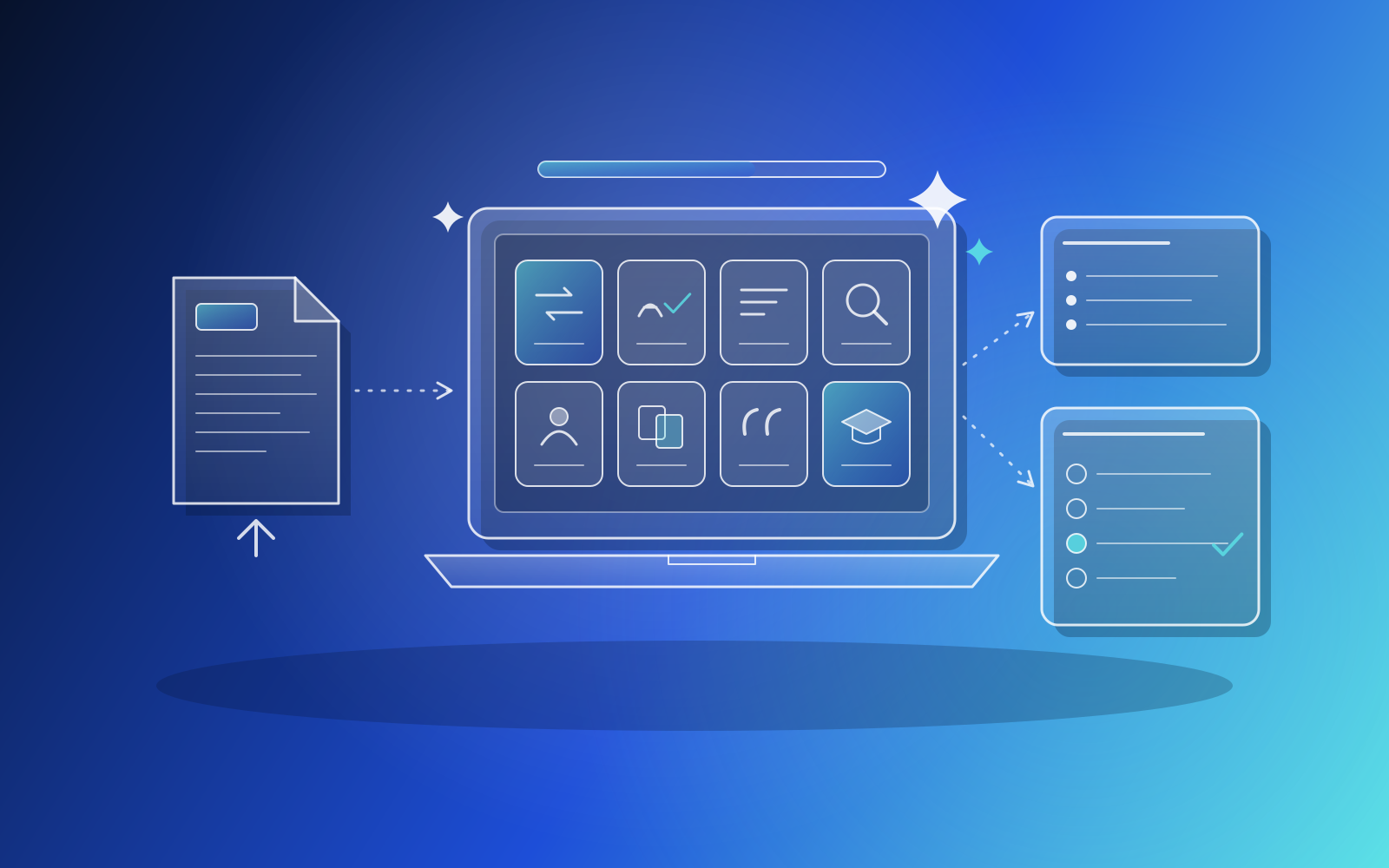
We designed and built an AI study platform for students from scratch, with eight tools covering paraphrasing, grammar, summaries, AI detection, plagiarism, citations and a study helper that turns uploaded documents into notes and quizzes. The React and Django product runs on AWS with single sign-on, subscription billing and usage metering.
EducationSaaS
Education compliance trust-management platform
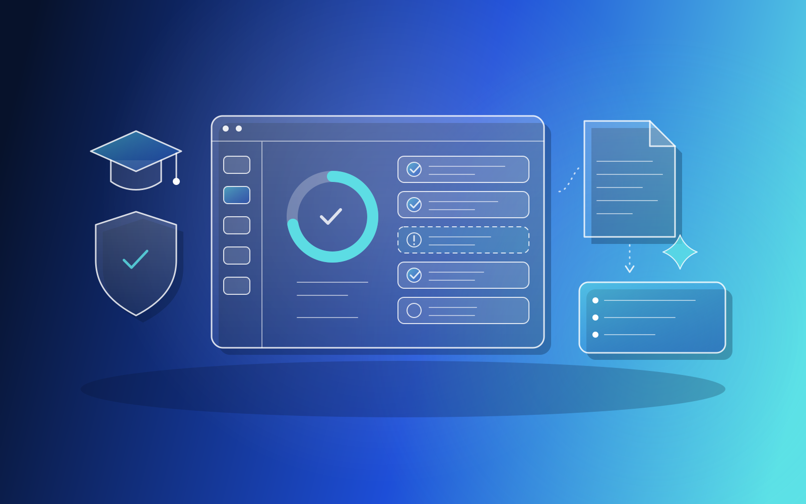
We designed and built an MVP compliance platform for the education sector, where organisations and suppliers see which regulations apply, link required items, upload evidence and track gaps. It includes AI summaries of uploaded compliance documents and runs on a cloud stack we set up and handed over.